

TL;DR
A MaxDiff ranking, built on maximum difference scaling, usually becomes a decision before anyone checks whether the top-two gap was real.
Utility scores measure relative importance within the tested set. They say nothing about absolute importance, adoption, or gap size.
Treat two items as tied when their score difference is smaller than twice the standard error of either estimate.
Read standard errors, confidence intervals, preference share, and segment cuts before reading the rank order as a decision.
A ranking tells you the order. Only the respondent's reasoning tells you what would flip it.
A misread MaxDiff ranking rarely gets flagged as a research error. It surfaces later as a shipped roadmap, a locked creative brief, or a category strategy built on a four-point gap that was statistical noise all along. By the time anyone re-examines the score behind a set of MaxDiff surveys, the decision has closed, and the money is committed.
MaxDiff analysis gives you something most ranking methods cannot: a utility score for every item in your study, whether those items are product features, service attributes, or messaging concepts, calibrated against real tradeoffs participants made. The problem is what the ranked list doesn't show: when sample sizes are moderate and items cluster mid-range, many adjacent scores fall inside the margin of error.
A team sees Feature A at 0.42 and Feature B at 0.38, reads a clear winner, and bets a quarter of the development budget or a full campaign spend on sampling variation. The correction lands in next year's plan, long after this year's research debrief.
This piece is a research-grade interpretation guide for MaxDiff analysis. It explains:
What utility scores actually measure
What constitutes a meaningful difference versus a close call
How to avoid overreading small rank changes between waves
The goal is to pair MaxDiff scores with the reasoning behind them, so a close gap gets read against what participants actually said.
What MaxDiff analysis actually measures (and what it doesn't)
How the method works
MaxDiff analysis, also known as maximum difference scaling or best-worst scaling, is a forced-choice method that measures relative preference. MaxDiff forces genuine trade-offs in ways flat rating scales cannot, which is exactly why utility scores exist in the first place.
Participants are shown sets of items, drawn from different combinations of the full attribute list, and asked to select the most and least appealing option in each set. A single MaxDiff survey question, one of the many ranking questions in a best-worst MaxDiff exercise, usually shows four or five items at once and asks respondents to pick the best and the worst from that set.
By repeating this trade-off across many combinations, the method produces utility scores that rank every item from most to least preferred within the tested set, at both the aggregate and individual levels. How you build those sets, the MaxDiff question design, matters as much as how you read them, a discipline covered in our guide to MaxDiff study design.
The output is a rank ordering with attached scores, normalized through MaxDiff scaling so results are comparable across participants and segments. A specific feature scoring 22 sits higher in the preference hierarchy than one scoring 14, which is all the number tells you.
What the score doesn't tell you
What MaxDiff analysis does not measure is equally important to understand:
It measures relative value within the tested set. A high-scoring item may still be irrelevant to the purchase decision.
It does not predict real-world adoption.
It does not reveal the magnitude of preference gaps in any meaningful sense. A utility score of 15 versus 12 means the item ranked higher in this specific set of trade-offs; reading it as "25% more important" overstates it.
The practical risk is that close rankings get treated as clear strategic priorities. When two features sit within a few points of each other, the gap may reflect statistical noise more than a genuine difference in customer preferences. The number arrives without the reason behind it, which is where stakeholder meetings go wrong.
How to tell whether the top two items are actually different or just within noise
Utility scores alone cannot tell you whether the gap between your top two items reflects a real preference or sampling variation. Take a simple MaxDiff example: item A scores 0.42 and item B scores 0.38. That looks decisive on a slide, but without standard errors or confidence intervals attached, you have no basis for treating those MaxDiff results as actionable.
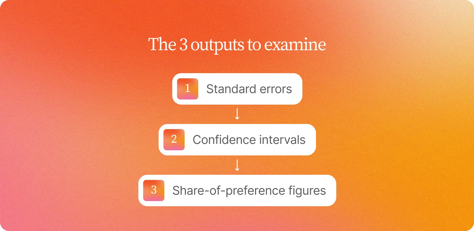
Before acting on a ranking, examine three outputs:
Standard errors for each utility score
Confidence intervals around each estimate
Share-of-preference figures across the full item set
If the confidence intervals for your top two items overlap, the observed gap may be noise. A practical threshold: if the difference between two utility scores is smaller than twice the standard error of either estimate, treat those items as statistically tied and design your next step accordingly.
Most online survey platforms running a MaxDiff experiment don't surface these diagnostics by default: rankings appear clean and ordered, with no uncertainty visible, and teams must either request the underlying outputs from their platform or calculate standard errors manually from the raw choice data.
"Even if you're doing dozens of in-depth interviews, multiple focus groups, you get those interesting nuggets and insights. But then you take them to the client and there's always a sense of: is this really a trend? It's very hard to validate, and very hard to demonstrate the difference between an important trend and a one-off anomaly."
— Fergus Navaratnam-Blair, VP Trends and Futures, NRG
Even when a difference clears the statistical threshold and the gap is real, the finding is incomplete. Knowing item A outperformed item B tells you the outcome. It leaves open what drove it, whether the winning attribute is one of the important factors behind the decision, and whether the preference holds across the segments that matter most.
What to look at besides the ranked utility list
MaxDiff helps you rank items, but the ranked utility list alone leaves two questions open: whether the gaps between items are meaningful, and whether that order holds across the target audiences that actually matter to your decision.
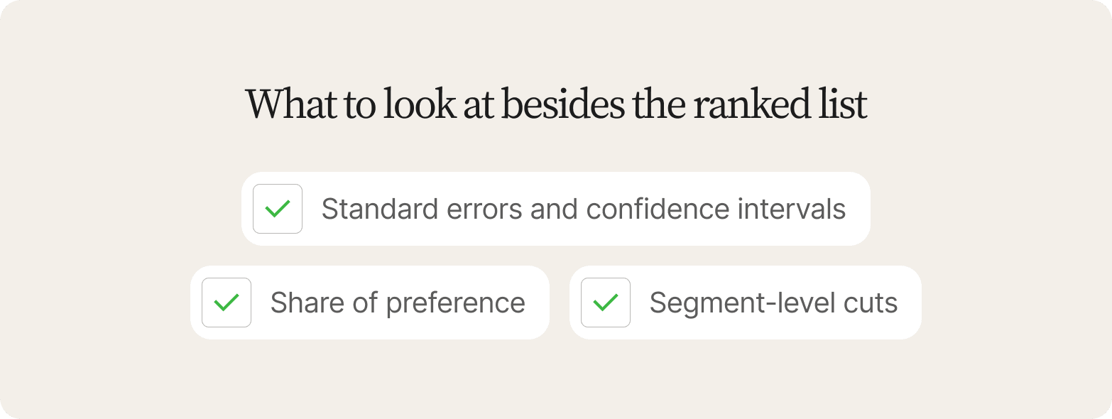
Three outputs deserve attention alongside the utility scores:
Output | What it shows | What it cannot show |
|---|---|---|
Standard errors and confidence intervals | Whether adjacent scores are statistically distinguishable | Why one item beat another |
Share of preference | How often each item was chosen as most important, as a percentage | Whether the gap would change behavior |
Segment-level cuts | Whether the aggregate ranking holds within each subgroup | What drives the differences between groups |
Standard errors and confidence intervals show whether the differences between adjacent attributes are statistically distinguishable or within the margin of noise.
Share of preference, also called preference share, converts raw utilities into the percentage tied to how often each item was chosen as "most important" across all tasks. This gives a more intuitive read for stakeholders who are not fluent in logit-scaled numbers.
Segment-level cuts, often called MaxDiff segmentation, split the data into different groups by role, region, or behavior to test whether the aggregate ranking holds within subgroups. Size each cut so every subgroup has enough respondents to read on its own.
A top-ranked attribute in the overall data may rank fourth among a critical buyer segment, evidence that preferences differ sharply by group, which changes the decision entirely. Teams that skip subgroup analysis often build messaging around a priority that matters in aggregate but is irrelevant to the segment they are actually trying to move.
Treat these three outputs as the minimum bar before any ranking reaches a roadmap conversation: a fragile ranking presented as a firm one is what costs an insights team its credibility with stakeholders. Together, these outputs show whether a ranking is reliable or fragile, though they still can't explain why an attribute won.
How to pair MaxDiff rankings with qualitative context
A MaxDiff ranking tells you the order. It leaves open why the top attribute won, what conditions would flip the result, and whether the person who ranked it first would actually change their behavior because of it. Each MaxDiff question sets up the trade-off; the follow-up interview explains it. Knowing how MaxDiff works means going beyond the utility scores to the reasoning that produced them.
Running the task and the interview in one session
This approach runs the MaxDiff task first, then moves immediately into targeted follow-up questions, allowing respondents to explain the trade-off while the platform continues collecting responses in the same session, pairing the ranking and the reasoning from the same person.
Three questions do the work:
"Why did you rank your top attribute highest?"
"What would need to change for your second-ranked attribute to win?"
"Would you switch from what you use now based on this ranking?"
Each targets a different layer: the first surfaces the actual driver, the second reveals the conditions under which the ranking is unstable, and the third tests whether stated preference translates to real behavior.
What video adds
Video-based follow-ups add something a MaxDiff count cannot: when a participant hesitates before answering why they ranked an attribute highest, or their tone shifts when asked about switching, those signals carry meaning the score alone obscures.
After the choice tasks, Conveo's AI research assistant probes the reasoning behind each participant's own choice pattern: why an item ranked best or worst, and the situations and trade-offs behind it. A researcher reviewing the video can then spot a mismatch between what someone chose and how they explained it. Those mismatches reveal the conditions that flip the trade-off, information a product or brand team needs before committing to a direction.
Teams that use MaxDiff on Conveo get every score alongside the AI-moderated conversation that produced it, so a close ranking can be read against participant reasoning. Each wave feeds a searchable insight library, where findings and their reasoning stay connected across every wave of research, so nothing gets researched twice.
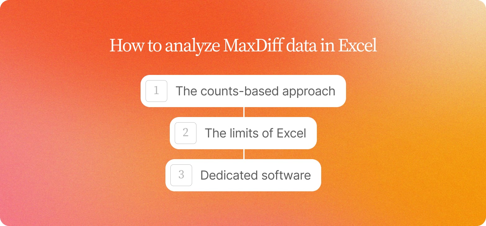
How to analyze MaxDiff data in Excel (and when to move beyond it)
1. The counts-based approach
Many teams start MaxDiff analysis in Excel because it requires no specialized software or specialized expertise, and the logic is straightforward enough to explain to a stakeholder in a single meeting, a genuine advantage for smaller studies.
This count analysis approach works as follows:
Tally how many times each item was selected as best across all tasks, then do the same for the worst options.
Subtract each item's worst count from its best count to produce a raw score.
Normalize those scores so they sum to zero across all items.
Rank items from highest to lowest.
Any MaxDiff calculator or pivot table can handle this arithmetic, and the resulting rank order is usually directionally accurate for clean, focused studies.
2. The limits of Excel
The limit of this approach: it holds up for studies under roughly 100 participants with fewer than 10 items, where you need a rank order and nothing more.
Once you need anything beyond that, Excel runs out of road. There are:
No confidence intervals
No hierarchical Bayes estimation
No latent class analysis
No way to test whether the gap between the first- and second-ranked item is statistically meaningful or noise
MaxDiff analysis in Excel also can't produce segment-level utility scores: you see average preference, with no view of whether different customer groups disagree.
3. When to move to dedicated software
When studies require robust standard errors, segment-level utilities, more data than a spreadsheet can meaningfully process, or integration with qualitative follow-up questions, the appropriate next step is one of the following:
Dedicated MaxDiff software built for real statistical modeling
A broader experience management platform
An online survey platform designed for advanced research methods like latent class segmentation
Some teams pair MaxDiff and conjoint analysis in the same study; conjoint analysis adds price and feature bundling into the trade-off, which count analysis and manual spreadsheets cannot model.
Multi-market MaxDiff analysis: translation effects, scale, and data quality
Running a MaxDiff experiment across multiple markets multiplies every design decision, and the mechanism behind any resulting shift in rankings matters more than the shift itself.
Translation and cultural effects
Translation effects alter how respondents interpret trade-off tasks: an attribute described as "reliable" in English may carry connotations of "basic" or "uninspiring" in another language, quietly depressing its rank without any signal in the data.
Cultural norms around expressing preference also vary: in markets where assertive choice-making is less socially comfortable, respondents may default to moderate selections, compressing the spread that makes MaxDiff discrimination useful in the first place.
Two experimental design decisions that cause avoidable problems
Direct pricing attributes. Currency conversion and purchasing power differences make cross-market comparisons unreliable.
Generic emotional-reaction prompts. These produce culturally biased responses that flatten cross-market insights.
Sequence translation review and pilot testing in every market before fielding.
Scale and respondent fatigue
Cap the number of multiple attributes at 12 to 15 items to materially improve data quality, particularly where survey participation is less common and respondent fatigue sets in faster; longer lists flatten MaxDiff discrimination because respondents stop genuinely weighing trade-offs.
Fraud screening and data quality
Fraud screening and attention checks are non-negotiable in panel-sourced multi-market MaxDiff analysis. Repeated-task designs are straightforward to game, and low-effort survey responses and inconsistent data are hard to spot without behavioral signals.
Video-based follow-ups, where participants explain a ranking in their own words, are the most reliable way to diagnose whether a result reflects genuine preference or disengagement. A participant who cannot articulate why they ranked an attribute highest is a data quality signal before it is a finding.
How to turn MaxDiff outputs into decision-ready narratives
MaxDiff outputs earn stakeholder trust only when they answer three questions: what the data shows, why it matters to the business, and what to do next. A utility score alone describes a rank ordering and answers none of them; the narrative turns that ordering into a decision.
Tie each key takeaway to a timestamped quote or clip so stakeholders can trace the evidence behind the ranking. If someone in the room asks "who said this?" and the answer is a spreadsheet column, the finding gets treated as opinion and dies in the deck. Teams working in Conveo trace each MaxDiff takeaway back to a timestamped quote or clip, so stakeholders can verify the evidence behind a ranking.
Triangulate the item that emerges as MaxDiff's top priority against behavioral signals: support ticket language, sales call objections, customer satisfaction scores, and product usage patterns. Rankings that hold across both stated preference and observed behavior carry more weight than rankings produced by a survey method that captures stated preference alone.
For a consumer product, run segment- or role-specific versions of the ranking: brand marketing, category insights, and innovation teams often weight claim, benefit, and pack priorities differently, and averaging them together hides the tension that stalls a launch decision. TURF analysis applied to these MaxDiff results maps which combination of claims or benefits reaches the broadest share of the target audience, giving claim ranking, benefit prioritization, pack messaging, and feature prioritization decisions a clearer market-coverage rationale.
How Conveo settles a close MaxDiff ranking
MaxDiff tells you what people prefer. Conveo's MaxDiff tells you why. The ranking and the reasoning come from the same person in the same session, so a close gap gets checked against what a participant actually said. Close rankings are a timing problem: the gap gets questioned in the debrief, and the study that would settle it usually lands after the decision.
Conveo is built by researchers, and the rigor is why the interpretation holds. The MaxDiff task and the AI-moderated follow-up run in the same session, so the number and the reason come from the same person. Every takeaway traces to a real participant on video, with base sizes shown alongside the scores, and participant reasoning settles near-ties, so the last voice in the debrief doesn't decide them.
See it in action in How AI-Moderated Video Interviews Actually Work:
The value also accumulates: the next MaxDiff study, whether it's testing product concepts, messaging, or pricing, starts with the trade-off logic the last one uncovered in the searchable insight library. For a team serving product, brand, and executive stakeholders at once, that compounding context turns MaxDiff into a running read on how consumers feel about the trade-offs that matter most.
Frequently asked questions
How do I tell whether the top two MaxDiff items are actually different or just within noise?
What should I be looking at besides the ranked utility list to avoid over-reading small gaps?
How do I pair MaxDiff rankings with qualitative context so the number and the reason come from the same participants?
Can I analyze MaxDiff data in Excel, or do I need specialized software?
How do I avoid translation effects and data quality issues in multi-market MaxDiff studies?
How do I turn MaxDiff outputs into a decision-ready narrative that stakeholders will act on?