

TL;DR
To present qualitative data stakeholders will trust, structure every finding as a theme backed by traceable evidence, participant IDs, verbatim quotes, and timestamped video clips, not narrative summaries they can't verify
Every claim needs traceability: participant IDs, timestamps, verbatim quotes, and video clips that anyone in the room can inspect
Structure findings as themes with weighted evidence, not as narratives or participant-by-participant stories, using systematic coding rather than one-off judgment calls
Video clips are the strongest evidence layer available because they show tone, hesitation, and context that written summaries flatten
Convert your analyzed data into decision-ready recommendations using the Finding-Implication-Recommendation framework with assigned owners and timelines
Traceability is what separates key insights stakeholders act on from findings they quietly set aside
Presenting qualitative data well means structuring every finding as a theme backed by traceable evidence, participant IDs, verbatim quotes, and timestamped video clips, rather than narrative summaries stakeholders can't verify. Qualitative research can now do something it could not do five years ago: produce stakeholder-ready evidence in days, with every finding traceable to a timestamped video moment, a verbatim quote, and a named participant. Real conversations at scale. Multimodal signals captured automatically. Research insights that compound across studies rather than disappearing into a shared drive.
And yet most qualitative presentations still fail. Not because the research process itself is weak, but because the evidence trail runs cold somewhere between data collection and the stakeholder meeting.
A slide that reads "users find onboarding confusing" invites argument. Someone asks which users, from which market, in response to which question. If the presenter cannot pull up the verbatim quote, the timestamped video clip, or the original discussion guide prompt in the next 30 seconds, the finding gets contested. The conversation shifts from what to do next to whether the data analysis behind it is reliable at all. That is a credibility problem, and it costs decisions.
The gap is structural. Qualitative research produces rich, layered evidence: real voices, visible reactions, language that no survey could have surfaced. But the standard presentation workflow strips most of that out:
Themes get abstracted into bullet points
Quotes get paraphrased into summaries
Video gets compressed into a single highlight reel that plays once and disappears
By the time findings reach the stakeholder meeting, the connective tissue between the raw data and the final claim has been cut.
The fix is not more slides or more quotes. It is a different architecture for how qualitative research methods translate into a decision-ready presentation. This step-by-step guide covers how to structure qualitative presentations, choose the right evidence formats, and build stakeholder trust through traceability, so you walk away with a clear understanding of what to change in your next deck.
Why Qualitative Presentations Fail (And What Stakeholders Actually Need)
Most guidance on presenting qualitative data focuses on structure: how many slides, which chart type, and where to put the executive summary. That is the wrong starting point. The real problem is not format. It is evidence.
Qualitative presentations fail when stakeholders cannot verify what they are being told. A slide that reads "users find onboarding confusing" is a researcher's interpretation, built on subsequent analysis of raw interview data. It might be accurate. It might reflect 12 hours of interview synthesis done with real rigor. But to a product director deciding whether to delay a launch, or a CMO deciding whether to reallocate budget, it is an assertion without a source. Assertions without sources get challenged, deprioritized, or ignored.
The root cause is a missing evidence chain. Narrative-only presentations ask stakeholders to trust the researcher's synthesis of the collected data without providing any way to inspect it. That is a significant ask in enterprise contexts where qualitative findings are influencing product roadmaps, campaign decisions, and budget allocation.
3 Things Stakeholders Actually Need
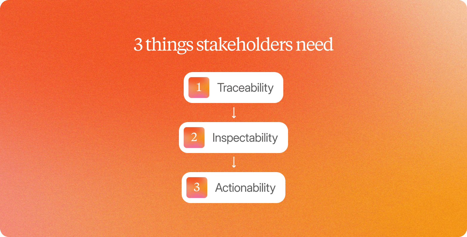
Enterprise stakeholders do not need more polished slides. They need three things that most qualitative presentations lack.
Traceability
Every claim should link back to specific participants and specific moments in the data collected. Not "several users mentioned friction" but "five of eight participants in the 25–34 segment flagged the document upload step, with three using language around distrust." That specificity, drawn from careful qualitative data analysis rather than gut feel, is what makes a finding defensible when it is challenged.
Inspectability
Stakeholders should be able to go one level deeper themselves. That means timestamped video clips, verbatim quotes with participant IDs, and searchable transcripts. When a product director can watch a 45-second clip of a participant abandoning an onboarding flow and hear the exact words they used, the finding stops being the researcher's opinion and becomes observable reality.
Actionability
Presenting qualitative data findings well means converting observations into actionable insights, not just themes. "Users find onboarding confusing" is an observation. "Three participants abandoned at the document upload step because they could not tell whether their data would be stored: recommend adding a one-line trust statement at that screen" is a recommendation a product team can act on by next sprint.
The difference between presentations that influence decisions and presentations that get filed away is not polish or narrative skill. It is whether stakeholders can see the evidence, inspect the source, and understand exactly what to do next.
Start with the Business Question, Not the Methodology
Presenting qualitative data well starts before the first finding slide. It starts with the opening frame, and most presentations get this wrong.
The default instinct is to open with methodology:
Sample size
Recruitment criteria
Interview protocol
The systematic coding framework used during the research process
Researchers include this information because they know it matters for credibility. The problem is that stakeholders experience it as overhead before the point.
The fix is structural. Build your opening slide around the business question that drove the research project, not the process used to answer it.
Compare these two opening slides:
Methodology-first: "We conducted 15 semi-structured video interviews with category buyers across three markets, using a thematic coding framework aligned with our research objectives."
Business-question-first: "Why are users abandoning onboarding at step 3, and what would need to change to keep them?"
The second version tells stakeholders immediately why they are in the room. Everything that follows reads as the answer to a question they already care about, rather than output from a research design they were not part of.
Methodology belongs in one dedicated slide or the appendix. One sentence is usually sufficient: "Findings are based on 15 video interviews with category buyers across the US and UK, conducted over five days." That sentence earns credibility without consuming the attention your key insights need.
Structure Findings as Themes with Evidence, Not Stories
The difference between a presentation that moves stakeholders and one that gets politely acknowledged comes down to structure. Narrative-style reporting asks the audience to follow a story. Structured thematic reporting, grounded in a disciplined analysis process, gives them a pattern they can act on.
The practical format: each theme occupies one slide, supported by three to five evidence points drawn directly from the analyzed data. Not summaries of what participants generally said. Specific quotes, behavioral observations, and timestamped video clips that prove the theme holds across multiple participants.
Here is what that looks like in practice:
Weak (narrative): "Participants described the onboarding experience as overwhelming and confusing."
Strong (structured theme): Theme: Onboarding cognitive overload. Evidence: 8 of 12 participants paused at step 3 without prompting. Verbatim: "I didn't know what to do next." [Clip 4:32]. Behavioral observation: six participants scrolled back to step 1 before proceeding.
The difference is traceable. A stakeholder reading the structured version can inspect the claim. They can watch the clip, count the instances, and verify the pattern themselves.
When presenting qualitative data from interviews to a skeptical audience, the evidence hierarchy matters:
Video clips carry the most weight because they are verifiable and emotionally immediate
Verbatim quotes come second, provided they are attributed and timestamped
Paraphrased summaries should only appear when direct evidence has already been established, never as a substitute for it
This is where mixed methods approach thinking helps too: pairing qualitative themes with any quantitative data you already have (like drop-off rates) gives stakeholders both the "what" and the "why" in the same slide.
Make Every Claim Traceable to Source Evidence
Stakeholders dismiss qualitative findings not because they distrust qualitative research, but because they cannot inspect the evidence behind it. When a recommendation reaches a CMI director's leadership team, "the research said so" is not a defensible position. The person presenting needs to show exactly who said what, when, and in response to which question.
The evidence chain works in layers. Every theme you surface should link back to specific participant IDs, not a vague count. Saying "most participants struggled with onboarding" is a claim. Saying "9/14 participants described onboarding friction (P1, P2, P4, P6, P7, P9, P11, P12, P14)" is evidence, and it is the kind of detail that comes from disciplined field notes taken during the interview itself.
The contrast between traceable and non-traceable formats:
Non-traceable: "Most users found the interface confusing."
Traceable: "8/12 participants (P1, P3, P5, P7, P9, P10, P11, P12) described interface confusion. Verbatim: 'I couldn't find the save button' [P3, 6:45]. [Video clip attached]."
The second format invites scrutiny rather than deflecting it. That invitation is what builds stakeholder confidence over time.
Before finalizing any qualitative presentation, apply this traceability checklist to every major claim:
Participant ID: Is every supporting data point attributed to a named participant identifier?
Timestamp: Can a stakeholder navigate directly to the moment in the recording?
Verbatim quote: Is the exact language preserved, not paraphrased?
Video clip: Is a watchable excerpt attached or linked for high-stakes claims?
Teams that build this habit into their standard output find that stakeholder pushback decreases, not because the findings are different, but because the evidence is now inspectable.
Presenting Qualitative Data Visually (Beyond Text-Heavy Slides)
Use Video Clips to Show, Not Just Tell
Presenting qualitative data visually starts with the most credible evidence format available: actual video of the participant in the moment. A transcript tells stakeholders what someone said. A 20-second clip shows them the pause before the answer, the slight frown at a price point, the hesitation that signals something the words alone never capture. This is where visual data does work that a paragraph of researcher summary cannot.
Selecting clips well is a practical skill. The criteria are straightforward:
The emotional reaction must be visible on screen
The verbatim quote must be audible and clear
The moment must directly support the theme you are presenting
Clips should run 15 to 30 seconds: longer, and the point gets lost; shorter, and the context disappears
Timestamp every clip in your presentation so stakeholders can return to the source recording themselves.
Build highlight reels rather than playing full interviews. Three to five clips, grouped by theme, give stakeholders a focused, coherent view of a pattern without requiring them to sit through 45 minutes of footage. For example:
One reel on onboarding confusion
One on price sensitivity
One on unmet expectations
Each reel makes the theme feel inevitable rather than interpreted, and it is a much faster route to identify patterns than reading a transcript line by line.
With Conveo, a video-first AI research platform, this evidence layer is built into the research workflow from the start. Every interview is recorded with automatic timestamping, and AI-generated thematic analysis links directly to the video moments that support each finding. Researchers do not need to manually clip and tag after the fact, and manual coding of raw footage is no longer the bottleneck it once was. The presentation-ready evidence exists the moment synthesis is complete.
In a representative scenario, a product team running an onboarding friction study presented written findings describing user confusion at a specific step. The stakeholder review met those findings with skepticism. The same finding, presented as three video clips showing participants stopping, re-reading, and sighing before abandoning the flow, closed the debate in minutes. The roadmap changed that week.
One consideration applies regardless of platform or process: always obtain explicit participant consent before using video clips in internal or external presentations. Consent should be captured at the study design stage, not added as an afterthought.
"The video clips make it tangible; it's not just data anymore; it's real people with real emotions"
— CMI Lead, Edgard & Cooper
Data Visualization for Qualitative Data Analysis: Evidence Tables and Thematic Maps
Bullet lists are the default output format for most qualitative synthesis. They are also the format most likely to make a CMI director's eyes glaze over in a stakeholder meeting. Bullets flatten evidence: every point looks equally supported, equally certain, and equally disconnected from the participant who said it.
Evidence tables solve this directly and are among the simplest forms of data visualization available to a research team. A well-structured evidence table uses four columns: theme, participant count as a fraction of the total sample (e.g., 8/12), a representative verbatim quote in the participant's own words, and a video clip timestamp when recordings are available.
Here is what that looks like for an onboarding friction study with 12 participants:
Theme | Participant Count | Representative Quote | Clip Timestamp |
Confusion at account setup | 9/12 | "I didn't know if I was creating a profile or just previewing." | 02:14 |
Trust gap at payment screen | 7/12 | "It felt like they needed my card before I'd seen anything." | 04:51 |
Cognitive overload at step 3 | 8/12 | "There were too many choices, and none of them were explained." | 06:33 |
Relief after completion | 5/12 | "Once I got through it, it actually made sense." | 11:07 |
Conveo's knowledge library generates these evidence tables and other visual representations of qualitative analysis techniques automatically from interview data, with each row linking directly to the source video clip. This means the traceability requirement is met at the point of analysis, not retrofitted during presentation prep.
Thematic maps take this further by showing causality rather than just co-occurrence. While the evidence table indicates cognitive overload occurred in 8 of 12 sessions, a thematic map shows that cognitive overload at step 3 leads to abandonment, which connects back to the trust gap at the payment screen. That directional relationship turns a list of observations into a diagnosis and gives the audience a broader perspective on how the friction points relate to one another.
Use Verbatim Quote Callouts for Impact
Verbatim quotes are the most direct evidence you can present to a stakeholder. A single participant sentence, displayed at scale and attributed precisely, carries more persuasive weight than three paragraphs of researcher synthesis.
The format is straightforward: pull one powerful quote per slide, set it in large text, and attribute it with a participant ID and timestamp. "P3, 6:45" tells your audience the evidence is traceable.
Quote selection is where this technique works or fails. The standard for a strong callout quote is threefold:
It must be emotionally resonant
It must directly support the theme the slide is making
It must use the participant's exact words rather than a cleaned-up paraphrase
The contrast between weak and strong usage:
Weak: "Participants found the interface confusing" (researcher conclusion)
Strong: "'I couldn't find the save button and gave up.' — P3, 6:45" (evidence)
Resist the urge to over-edit. Filler words, pauses, and slightly awkward phrasing often carry the emotional signal that makes a quote land. "I just... I don't know, it felt off" communicates hesitation that a polished version erases. Preserve participant language, the same way a careful field notes entry would.
How to Present Qualitative Data from Different Research Methods
Different qualitative methods produce different raw data, and each needs its own presentation approach. What holds across all of them is the same underlying qualitative inquiry: find the pattern, evidence it, and make it inspectable.
Presenting Interview Data
Presenting interview data in qualitative research is one of the more demanding tasks in the research workflow: raw sessions must be transformed from recordings into stakeholder-ready findings without losing the nuance that made the interviews worth running.
The structure that holds up best for interview presentations is theme-based, not participant-by-participant. Walking stakeholders through "what Participant 1 said, then Participant 2" produces a list rather than an argument. Organizing by theme, with evidence drawn across participants, lets the finding carry its own weight.
Evidence hierarchy matters here:
Video clips carry the most credibility because they show tone, hesitation, and context that a written summary flattens
Verbatim quotes come next, preserving the participant's exact language
Paraphrased summaries are useful for volume but should always be supported by at least one direct quote
The contrast between sequential and parallel interview approaches matters for presentation timelines. When a research team runs 15 onboarding friction interviews sequentially, synthesis can take two to three weeks. Running those same interviews in parallel and asynchronously compresses the field period to days, not weeks. With Conveo, teams receive thematic analysis and timestamped video evidence while the decision is still forming, rather than after it has already been made. The platform's AI moderator conducts interviews in 50+ languages simultaneously, meaning multi-market studies that once required weeks of sequential fieldwork now deliver presentation-ready evidence within the same planning cycle.
Presenting Focus Group Data
Focus groups generate a specific presentation problem that in-depth interviews do not: what sounds like consensus in the room often is not. When one articulate participant frames an opinion early, others tend to align with it, not because they independently agree, but because group dynamics reward agreement.
The practical fix is to structure focus group findings by theme rather than by session. Organizing by session ("Group 1 said X, Group 2 said Y") invites false comparison that obscures real patterns. Organizing by theme forces you to pull evidence from across all groups and assess genuine convergence versus group-driven momentum, a common qualitative analysis technique for controlling group bias.
The evidence format matters here more than in individual interviews. For each theme, note the number of participants who raised it unprompted across all groups, then anchor it with verbatim quotes that carry a group and participant identifier, such as "Group 2, P5." That attribution lets stakeholders assess whether a strong quote reflects a single vocal participant or a pattern that emerged independently, rather than an alternative explanation such as recency bias in the room.
Where individual interview evidence can be presented as a participant's own unprompted view, focus group evidence requires an extra layer of qualification. Note when a theme emerged before group discussion shaped it, and flag when it appeared only after another participant introduced it.
Presenting Survey Open-Ends and Questionnaire Data
Presenting qualitative data from a questionnaire starts with accepting what questionnaire data cannot do: it cannot follow up. When a participant writes "it felt confusing," a static open-end stops there. There is no probe for what felt confusing, no follow-up on whether confusion affected their decision.
Open-ended survey responses still follow the same thematic coding logic as interview data. You read across responses, group similar language into clusters, assign codes, and build themes, essentially applying the same qualitative research methods used for interview transcripts to a much larger volume of unstructured data. The difference is volume and depth: surveys can yield hundreds of responses in hours, but each response is typically one or two sentences.
The presentation structure follows three layers:
Theme: state it in plain language
Frequency: report how often it appeared across your response set (for example, 38% of participants mentioned price uncertainty as a barrier)
Representative quote: anchor it with one or two verbatim quotes
The critical qualifier: survey open-ends reveal surface-level patterns, not deep understanding. A finding like "participants expressed confusion around onboarding" is directional, not diagnostic. It tells you where to look, not what to fix. Framing findings as "early signal" rather than "confirmed insight" keeps stakeholder expectations calibrated, and it is worth flagging this distinction explicitly rather than assuming stakeholders will infer it on their own.
How to Present Demographic and Sample Characteristics
Presenting demographic data in qualitative research is one of the more consequential formatting decisions a researcher makes. Get it wrong in either direction, and you either bury the findings under participant profiles or leave stakeholders wondering whether the sample was fit for purpose. The rule is straightforward: demographics should orient the audience, not dominate the presentation.
The most effective format is a single summary slide or table placed early in the report, immediately after the objectives section.
For a 15-participant onboarding study, that summary table might look like this:
Characteristic | Sample Profile |
Total participants | 15 |
Age range | 28–52 |
Gender breakdown | 9 women, 6 men |
Geographic distribution | 8 US (Northeast, Midwest), 4 UK, 3 Germany |
Product usage / behavioral segment | 7 new users (under 30 days), 8 returning users (3+ months) |
Surface the segments most relevant to the research question, not every characteristic collected during screening. If onboarding experience level is central to the particular topic under investigation, it earns a row. Participant household income probably does not.
Segmenting findings by demographics is only warranted when the research question requires it:
If the study is asking whether onboarding challenges differ by user experience level, separating new and returning user responses is analytically necessary
If the question is about general onboarding friction, demographic segmentation adds complexity without adding insight
When demographics are not central to the findings, move the full breakdown to the appendix. Stakeholders who need to interrogate the sample can find it there.
How to Convert Qualitative Findings into Decision-Ready Recommendations
The most common failure in qualitative research presentations is not weak data. It is stopping at the data.
Teams spend weeks collecting rich participant responses, synthesizing themes, and building a narrative, then close their decks with observations and leave the room with no clear next step. Presenting qualitative data findings well means understanding that a theme is not a recommendation and that the writing process for a stakeholder deck differs from that for an academic report.
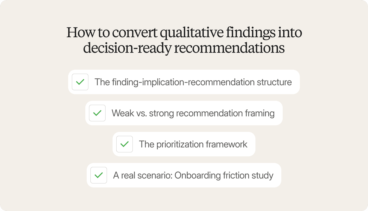
The Finding-Implication-Recommendation Structure
Every qualitative finding needs to travel through three stages before it reaches a stakeholder:
Finding: What participants said or did. This is the theme plus the evidence: specific behaviors, direct quotes, and patterns across sessions.
Implication: What this means for the business. Translate the finding into a consequence: what is at risk, what opportunity exists, what decision it affects.
Recommendation: What the team should do about it. A specific action, assigned to an owner, with a timeline attached.
Weak vs. Strong Recommendation Framing
The difference between a finding that gets acted on and one that gets shelved often comes down to specificity, the same discipline good research writing demands regardless of audience.
Weak framing: "Users find onboarding confusing. Consider simplifying." No owner. No urgency. No criteria for success.
Strong framing: "8 of 12 participants abandoned onboarding at step 3, citing unclear call-to-action labels. Implication: this maps directly to the 30% drop-off rate the product team already flagged in analytics. Recommendation: redesign step 3 with a single primary CTA. Owner: UX team. Timeline: next sprint."
The second version connects qualitative evidence to a quantitative signal, names the exact friction point, and gives a team something to ship.
The Prioritization Framework
Not every recommendation carries equal weight. Rank recommendations across two dimensions: impact (high, medium, low) and effort (high, medium, low).
High-impact, low-effort: Do first. Decisions that move the needle quickly.
High-impact, high-effort: Plan for next quarter. Worth the investment but need resourcing.
Low-impact, low-effort: Quick wins. Useful for building momentum.
Low-impact, high-effort: Deprioritize. Flag explicitly so they do not resurface.
A Real Scenario: Onboarding Friction Study
In a representative scenario, a product team ran a 15-participant study on onboarding drop-off. The research surfaced five distinct friction points, each converted into a structured recommendation with an owner and timeline. The prioritization matrix placed two in the "do first" quadrant (CTA redesign and progress indicator), two in the "next quarter" quadrant (account setup flow and email confirmation sequence), and one in the "deprioritize" quadrant (optional profile enrichment step).
The output was not a 40-slide narrative deck. It was a one-page recommendation summary with five rows: finding, implication, recommendation, owner, and timeline. The product and UX leads left the session with a sprint plan, not a discussion.
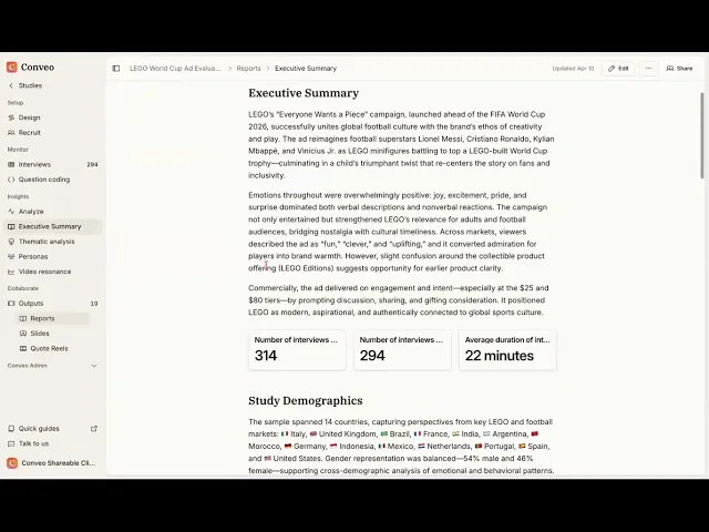
Watch the walkthrough: Reading a Conveo Report: How Insights Are Packaged for Decision Makers →
With Conveo, this path from interview to recommendation is compressed. Because every finding in the platform's thematic analysis links directly to timestamped video evidence and participant IDs, the evidence chain required for strong recommendations is already built at the point of synthesis rather than assembled manually during presentation prep.
How to Build Stakeholder Trust Through Traceability and Transparency
Stakeholders who were not in the room during fieldwork have no reason to trust a summary slide. They did not hear the conversations. They did not see the hesitation before a participant answered a pricing question. When findings arrive as a deck with bullet points and no visible evidence trail, skepticism is the rational response.
Traceability is the practice of connecting every claim in a research output back to the source material that generated it. It is the structural requirement that separates findings stakeholders will act on from findings they will quietly set aside.
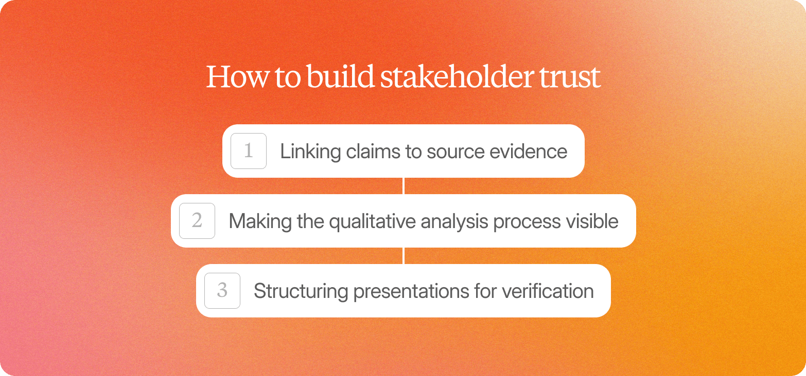
Linking Claims to Source Evidence
Every thematic finding should carry a reference path back to its origin. In practice, this means attaching participant identifiers, session timestamps, and direct quotes to each claim at the point of synthesis, not as an appendix readers will not open. Delve deeper into any single claim, and a stakeholder should find source evidence in one click, not three.
Video clips are particularly effective for this. A 45-second clip of a participant's unscripted reaction carries more persuasive weight with a non-research stakeholder than a well-written paragraph about the same moment. The clip is the evidence. The paragraph is the interpretation. Both belong in the same place, in the same document.
Making the Qualitative Analysis Process Visible
Stakeholders who distrust AI-generated outputs often are not distrusting the technology itself. They are distrusting the black box: findings that appear without any visible reasoning behind them.
This means structuring outputs so stakeholders can see how themes were built: which participant responses were grouped together, what criteria defined the grouping, and where the analyst made a judgment call. That level of transparency builds confidence because it shows the work rather than hiding it, much like a well-kept set of detailed notes would if a stakeholder asked to see them.
Structuring Presentations for Verification
The most credible research presentations are built so that any claim can be challenged and checked. This means organizing findings by evidence weight, flagging where sample size limits generalizability, and distinguishing between key themes that appeared across most participants and observations that surfaced in only a few sessions.
Findings structured this way invite scrutiny rather than deflect it. That posture is what builds long-term stakeholder trust in a research function. When you present qualitative data in a way that invites verification, the research function becomes a source of decisions rather than debate, and it consistently provides insights that hold up under follow-up questions.
How Conveo's Qualitative Data Analysis Software Delivers Key Insights, Stakeholder-Ready
As of 2026, the gap between qualitative insight and stakeholder action comes down to one thing: whether the evidence chain is intact when findings reach the meeting room. Conveo, a video-first AI research platform and qualitative data analysis software layer built for enterprise teams, is designed to close that gap structurally rather than through better storytelling.
Automatic traceability from interview to theme. Every AI-generated finding in Conveo links directly to the timestamped video clip, the verbatim quote, and the participant ID that support it. When a stakeholder challenges a finding, the evidence is one click away, not buried in a transcript folder, and analysts spend far less time on manual coding as a result.
Parallel research at scale. Conveo's AI moderator conducts hundreds of conversations in parallel across 50+ languages, compressing field periods from 6–10 weeks to 3–5 days. Presentation-ready thematic analysis arrives while the decision is still forming.
A compounding knowledge library. Findings do not disappear after one presentation. Conveo's knowledge library, a purpose-built qualitative data analysis software layer on top of every study, stores every insight with its full evidence trail, so teams can build on previous studies, compare themes across waves, and present longitudinal patterns that strengthen the research function's credibility over time.
Compliance built in. With SOC 2 certification, GDPR compliance, and consent management integrated into the research workflow, teams present findings knowing the evidence trail meets enterprise governance requirements. No retroactive consent chasing. No compliance gaps when clips reach a leadership audience.
Frequently Asked Questions
How do you present qualitative data to stakeholders who prefer quantitative data?
What is the best format for presenting qualitative research findings?
How many video clips should you include in a qualitative presentation?
How do you handle stakeholder pushback on qualitative findings?
How long should a qualitative research presentation be?