In this article
TL;DR
Quantitative UX research measures what users do through quant data: completion rates, error frequencies, SUS scores, funnel drop-offs. It cannot explain why users behaved that way.
A/B testing, closed-question surveys, funnel analysis, SUS tracking, and tree testing are methods that each address a particular type of question. The wrong method produces data that stalls decisions rather than moving them forward.
The gap between a quant signal and a usable explanation is a timing problem. Traditional qualitative follow-up often takes weeks, and by the time the explanation arrives, the decision window has already closed.
When a researcher spots a friction point in the analytics, they can launch AI-moderated video interviews to probe that exact moment, run sessions in parallel, and return thematic findings while the decision is still open.
Pairing structured quantitative questions with open-ended responses from AI-moderated interviews within the same study yields both the quantitative data and the deep understanding behind it, from the same participant in the same session.
Completion drops from 74% to 58%, and the team ships copy variants without knowing why users actually stopped. That is the situation quantitative UX research is built to surface: a measurable signal that something changed, precise enough to trigger a conversation but not precise enough to resolve it.
The following examples throughout this article are representative scenarios, not reported results from a named Conveo customer. They illustrate patterns that recur across product teams.
Quantitative UX research measures behavior. Completion rates, error frequencies, SUS scores, funnel drop-offs, time spent on task: these numbers, this quantitative data, tell a product team where users are struggling and how often. They are reliable, scalable, and fast to collect, and a well-instrumented product can surface a meaningful shift within hours of a release.
What quantitative UX research cannot measure is why users behaved that way. It does not capture what the user was thinking, what language they'd use to describe the friction, or whether the problem was the copy, the flow, or something that happened on earlier screens. A 16-point drop in completion is a finding. The explanation sits somewhere else.
The operational constraint is what makes this gap consequential. Product teams run on fixed sprint cadences, often two weeks. A behavioral signal that surfaces on day three has roughly ten days before the next planning meeting. Traditional qualitative follow-up: recruiting, scheduling, moderating, transcribing, and synthesizing, often takes weeks. By the time the explanation arrives, the sprint that needed it has closed, the next two have shipped, and the team has already made its best guess.
When a researcher spots a friction point in the analytics, AI-moderated video interviews let them probe that exact moment and gather information while the decision is still live. Sessions run in parallel, and thematic findings may emerge while the decision window remains open.
What is quantitative UX research?
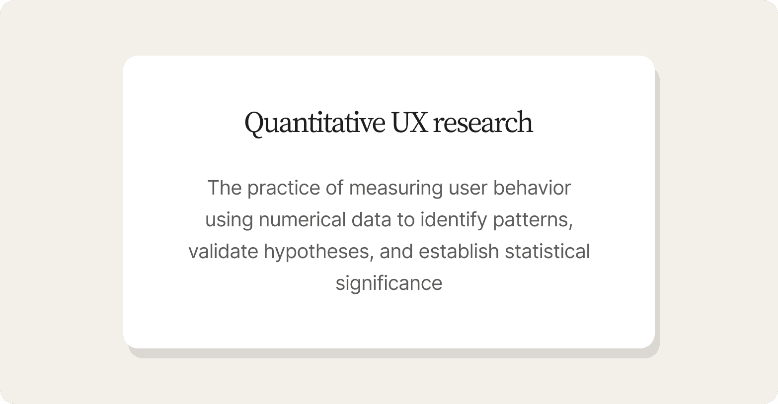
Quantitative UX research is the practice of measuring user behavior using numerical data to identify patterns, validate hypotheses, and establish statistical significance. Where qualitative UX research, and qualitative user research more broadly, captures what users think and feel, quantitative UX research (a specific application of the broader field of quantitative user research) captures what they actually do, and at what rate. It mirrors the larger split between qualitative and quantitative research, and between qualitative research and quantitative research: one explains, the other counts.
The core measurement categories in quantitative UX research include:
Task success rates – did the user complete the task
Task completion times – how long it took
Error frequencies – how often something went wrong
System Usability Scale (SUS) scores – standardized perceived-usability rating
Funnel conversion metrics – where in a flow users drop off
A/B test results – which variant performed better, and by how much
Each of these represents a distinct data type that can be tracked over time and compared across segments. Together, they form the backbone of quantitative usability testing: validating interface decisions with numbers instead of opinions.
UX quantitative research, or quantitative user research applied to an interface, is the right approach when the question is closed, and the team needs a statistically defensible answer backed by real statistical analysis rather than intuition. "Which variant performed better?" "What percentage of users exit at step three of checkout?" These are answerable with numbers, and numbers are what the decision requires. When the question has a defined outcome and sufficient sample size to reach statistical significance, quantitative methods are the appropriate approach.
Where quantitative research in UX runs into its limits is the moment the team needs to understand causes rather than confirm patterns. An A/B test can tell you that variant B won by a statistically significant margin. It cannot tell you why the control lost, or which element of the variant drove the difference. When two user segments show nearly identical success rates but one reports consistently lower satisfaction, the numbers surface the gap but cannot explain it. That explanation requires an entirely different method, which is the primary difference between confirming a pattern and understanding it.
There's also a practical constraint most UX teams face: statistically significant quantitative studies require large user samples, and many embedded research teams don't have reliable access to those samples or a dedicated quantitative UX researcher, sometimes shortened to quant UXR in job postings, on staff. Often, one to three researchers serve multiple product squads simultaneously.
Running a properly powered A/B test, a large-scale usability benchmarking study, or any quantitative usability studies at scale requires a high-traffic product, a panel relationship, or both. Beyond sample access, the studies require statistical expertise to design and interpret responsibly. Misread confidence intervals or underpowered tests produce conclusions that feel certain but aren't. That gap between what quantitative UX research promises and what most teams can actually execute is where many product decisions quietly go wrong.
Quantitative UX research methods
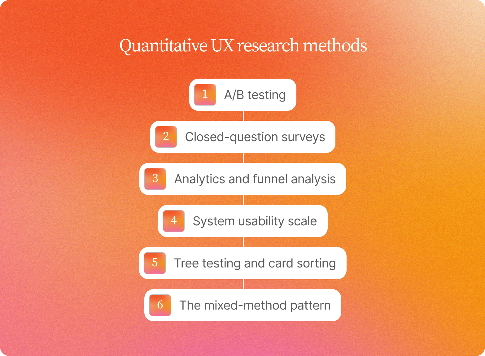
Choosing the right quantitative UX research methods, and quantitative user research methods more broadly, starts with your research goals. The five UX research quantitative methods below sit within the broader landscape of user research methods and qualitative user research methods, organized by decision context: match specific methods to specific questions.
A/B testing: use when comparing discrete variants
Reach for A/B testing when you have two clearly defined variants and statistical significance matters more than understanding why one outperformed the other. It is a form of experimental research, and multivariate testing extends the same logic to several variables at once. It is the right method for validating a button placement, a headline, or a change to the checkout flow against a control. Statistical significance here means rejecting the null hypothesis that the two variants perform the same, not proving the winning variant is objectively better.
What it measures: conversion rate, click-through rate, task completion
What it cannot explain: the reasoning behind the preference, or the hesitation that preceded the click
Teams that skip the qualitative follow-up often ship the winner without understanding what made it win.
Closed-question surveys: use when measuring distribution at scale
Surveys with closed-ended questions are the right call when you need to measure preference distributions or satisfaction scores across a large sample or broader audience quickly. CSAT and NPS follow this pattern. Careful survey design matters here: a poorly worded closed question produces survey data that looks precise but measures the wrong thing.
What they cannot explain: context, contradiction, or hesitation. A satisfaction score of 7 out of 10 tells you nothing about whether that reflects a minor inconvenience or a workaround users have quietly built into their workflow.
Analytics and funnel analysis: use when diagnosing where users exit
Funnel data is the right starting point for locating a drop-off. Explaining it takes another method. Whether the source is web analytics, app analytics, or a platform like Google Analytics, the underlying analytics data tells you where users are, not what they are thinking.
What it measures: exactly where users abandon a flow – analytics tells you that 40% of users abandon at step three
What it cannot explain: whether they left because the form was too long, the copy was confusing, or they got interrupted. Session replays and log data can supplement the picture, but they still fall short of direct observation of the user explaining their intent in the moment.
Treating funnel data as a finding rather than a hypothesis is a common and costly mistake in product research.
System Usability Scale (SUS): use when tracking perceived usability over time
The SUS is a validated ten-item questionnaire used for usability testing over time, producing a single benchmarkable score, making it useful for tracking perceived usability across product iterations. Use it when you need a comparable measure across releases, or as part of ongoing usability benchmarking against an industry standard.
The risk: stability without signal. A flat SUS score across two releases can mask rising friction that only becomes visible in session recordings. A steady score means perceived usability held flat, which can happen while the underlying experience gets harder to use.
Tree testing and card sorting (quantitative variants): use when validating information architecture
These are the right quantitative UX research methods when an information architecture decision needs statistical backing before it ships. Tree testing measures task success rates against a proposed navigation structure. Card sorting, run at scale, reveals how users mentally group content and whether your categories align with their mental model.
What neither can resolve: why a user took the wrong path, or what mental model led them there. The data are quantitative, but interpretation requires judgment calls more typical of qualitative research methods.
The mixed-method pattern
The most efficient response to the limits above is pairing structured quantitative UX research methods with AI-moderated interviews, a form of user interviews, in the same study session. Mixed methods researchers have made this case for years: a number without qualitative insight is a correlation waiting for an explanation. Instead of running a survey, waiting for results, and then commissioning a separate qualitative study weeks later, teams can pair closed questions with open-ended responses in a single study. Conveo's platform supports this directly: a participant completes a preference task or satisfaction scale, and the AI moderator probes the reasoning in the same session, producing both quantitative data and deep understanding from the same person at the same moment. That pairing compresses the research cycle without sacrificing depth.
When quantitative UX research fails without qualitative follow-up
Quantitative UX research tells you that something broke. It rarely tells you what to fix.
A flat System Usability Scale score or a stable task completion rate can look like a clean bill of health while friction quietly accumulates in session recordings. Any UX researcher who has watched a flat SUS score mask rising friction knows the feeling.
Three failure patterns repeat across product teams often enough to be worth naming directly.
Onboarding completion drops, copy gets blamed
A team watches onboarding completion fall from 74% to 58%. Based on the quantitative data alone, the obvious hypothesis is that the copy is unclear, so they spend two sprints testing copy variants, with completion barely moving. What the analytics never surfaced: users expected autosave and abandoned the moment they realized it was not there. The copy was never the problem. Without a qualitative explanation, the team optimized the wrong variable for weeks.
An A/B test produces a winner no one understands
Variant B lifts completion by 11 points. The team ships it. What the test did not capture: variant B also drops satisfaction scores, because the redesigned flow removed a confirmation step users relied on to feel confident before submitting. The number said ship. The experience said wait. A metric about the product's performance can point a team in the wrong direction just as easily as the right one.
Funnel analysis flags an exit, but not a cause
40% of users leave at step 3. Analytics can confirm the exit rate but not the cause: most users are confused by an ambiguous field label, overwhelmed by the number of inputs, or uncertain whether the form would share data they didn't want to share. Each cause points to a different fix, and treating them as interchangeable sends the team down the wrong path for a full sprint.
The operational consequence matters here. Data-driven design and quantitative research for UX work on fixed sprint cadences. A quant signal that surfaces in week one may not receive a qualitative explanation for weeks, by which point the team has already shipped a hypothesis, not a decision.
The traditional qualitative response is live-moderated sessions. They work well, but researcher calendars cap throughput at around 10 to 15 sessions per study. Surveys offer scale, but they flatten the context that makes qualitative data useful: hesitation, contradiction, and the specific language users reach for when something does not work. A survey can confirm that users found step three confusing. It cannot capture the pause before they answered, or the different ways they described the problem before settling on one.
The gap between a quant signal and a usable explanation is a timing problem. The question is whether the research process can deliver that explanation while the decision window is still open, or whether teams will keep shipping on the best available guess.
Closing the gap between quant signals and explained causes
Quantitative UX research tells you what happened: completion dropped to 58%, time on task spiked, and users abandoned at step three. What it cannot tell you is why, and by the time traditional qualitative follow-up arrives, the sprint planning meeting that needed those answers has often already closed.
The shift that matters is timing. AI-moderated video interviews compress the gap between signal and explanation enough to inform the next sprint rather than document the last one.
The operational model works like this. When analytics tools flag a friction point, the AI moderator probes that exact moment: "You stopped at step three. What were you thinking right then?" That question, asked consistently across every session, converts a drop-off metric into a cause and lets the team gather information systematically. Because sessions run in parallel across 10 to 1,000 conversations simultaneously, explained observations can land in days rather than across the weeks a sequential, human-moderated study would require. Participants complete sessions on their own schedule, removing calendar and time-zone friction.
See it in action: How AI-Moderated Video Interviews Actually Work

What AI moderation preserves from live-moderated qual matters as much as the timeline. Video capture, tone analysis, and verbatim responses surface drivers analytics cannot diagnose: expectation mismatches, mental-model conflicts, discoverability failures. A participant's hesitation, or the exact words they use to explain what they expected, gives the team a deep understanding a metric alone can't provide.
The mixed-method advantage compounds this further. Pairing structured quantitative UX research questions with open-ended interviews in the same study links patterns to explanations without separate research cycles.
Traceability is what makes findings stick internally: timestamped video clips and verbatim quotes give stakeholders a direct line back to the participant who said it, cutting the "prove it" debates that slow alignment.
How quantitative UX research differs from data analytics and experimentation
Three methods that look similar on a slide deck create very different problems when applied to the wrong question. Understanding how quantitative UX research differs from data analytics and experimentation is the starting point for making the right choice.
| Quantitative UX research | Product analytics | Experimentation (A/B testing) | |
|---|---|---|---|
| Use this when | You need statistically significant evidence about behavior patterns across a representative sample: task completion rates, error rates, time-on-task benchmarks | Diagnosing where users exit, which features get used, and how engagement changes over time | Comparing discrete design or copy variants where statistical significance matters more than understanding why one won |
| Core assumption | Access to a large enough sample and the statistical expertise to design and interpret the study correctly | Instrumentation is in place, and events are tagged correctly before the question surfaces | Sufficient traffic exists to reach significance within a timeline that still allows the decision to move |
| What it reveals | How many users are affected and how consistently across a defined population | Where the friction appears in the product flow | Which variant performs better on a defined metric |
| What it cannot reveal | Why behavior changed without qualitative follow-up | Mental models, expectations, or the language users use to describe friction | Why one variant won, or what trade-offs it created that the primary metric did not capture |
| Risk | Measures the pattern but leaves the cause undiagnosed | Flags the location of a problem, not its source | Counterintuitive results (variant B wins on completion but loses on satisfaction) require a separate investigation to diagnose |
The primary difference between quantitative UX research and data analytics is scope and intent. Quantitative UX research centers on user behavior measured against research-defined tasks and representative samples. Product analytics centers on instrumented product events, which reflect actual usage but cannot capture what users expected, intended, or felt. Both produce numbers. Neither produces explanations on its own.
All three methods share the same operational gap: they flag problems but can't diagnose causes, and each result becomes the starting point for a qualitative follow-up study stuck in the same recruitment queue.
AI-moderated interviews let researchers field targeted follow-up on any of these signals while the decision is still open, explaining a counterintuitive result before the rollout or design decision closes.
Running quantitative UX research inside sprint cadence
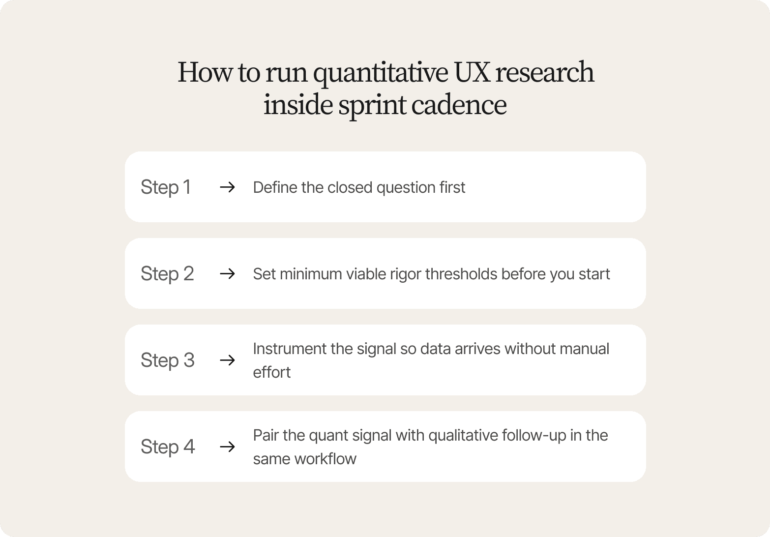
Quantitative UX research inside a two-week sprint cadence has a hard expiry problem: by the time a metric flags something worth investigating, the sprint planning meeting may already be closed. The question is whether the workflow can deliver both the quant signal and the qualitative follow-up in time. Here is a four-step playbook for making that work.
Step 1: Define the closed question first
State exactly what you need statistical confidence on before setting up anything else:
✅ Answerable with quant research: "Which variant achieves higher task completion?" or "What percentage of users abandon at step 3?"
❌ Not answerable with quant research: "Why do users prefer variant A?"
Open questions require qualitative methods. The question shape determines the method, not the other way around.
Step 2: Set minimum viable rigor thresholds before you start
Specify sample size, confidence level, and the timeline constraint together; decisions that belong in the research design phase, before a single session runs. A little statistical analysis at this stage goes a long way. If reaching statistical significance requires more sessions than a single sprint allows, quant is the wrong method for this cycle.
Step 3: Instrument the signal so data arrives without manual effort
Set up analytics tools, A/B test tracking, or survey distribution so collection happens automatically. If a researcher has to pull data by hand, the signal arrives too late.
Step 4: Pair the quant signal with qualitative follow-up in the same workflow
When the metric flags a problem, whether completion drops or variant B wins on clicks while satisfaction falls, the next move is to understand why. Running AI-moderated sessions in parallel, at a scale live-moderated research cannot match, produces the breadth needed at sprint speed, while still capturing video, tone, and verbatim quotes.
The deliverable format matters as much as the timeline. Stakeholder-ready reports that pair the quant signal ("58% completion at step 3") with timestamped video clips and participant quotes explaining why users stopped reduce the "prove it" debates that slow decision alignment. Product managers and engineers can see the metric and the explanation in the same document, without waiting for a full debrief presentation.
For teams operating within enterprise governance requirements, Conveo is SOC 2 Type II certified, GDPR compliant, EU hosting (Belgium), which addresses the security and data residency blockers that often impede procurement approval.
Stakeholder-ready deliverables for quantitative UX research
Quantitative UX research findings most often fail to drive product decisions because stakeholders can't connect a metric to a specific action. A completion rate of 58% is valuable quantitative data, but on its own it doesn't say what to fix.
Three deliverable templates close it for quantitative UX research studies.
Decision table
Pair the quant metric with its qualitative explanation and a named recommendation in a single row:
| Metric | Qualitative explanation | Recommended action |
|---|---|---|
| Variant B: 68% completion, SUS score 3.2 | Users completed faster but felt rushed and uncertain about data privacy | Ship Variant B with an added privacy reassurance step – a specific UX improvement rather than a vague direction |
A row like that gives a planning meeting something to decide on. A completion rate alone leaves the decision open. Some teams still assemble these decision tables by hand in a spreadsheet like Google Sheets; the format matters more than the tool.
Timestamped video evidence
When 40% of users exit at step 3, the metric flags the problem. The video clip shows the exact moment they stopped, and the quote explains why: "I didn't know if clicking Next would charge my card." Stakeholders who would otherwise ask for more data can watch 90 seconds of footage and reach the same conclusion as the researcher. That traceability speeds alignment from days to hours, and makes any roi calculations on the research itself easier to defend.
Segment-specific playbook
When quant shows segment differences with similar headline numbers, the deliverable needs to go further. Mobile users complete at 72%, desktop at 74%, but mobile satisfaction scores are lower. The playbook pairs each segment with the qualitative explanation driving the friction: mobile users report losing progress when switching apps mid-flow, desktop users don't. The recommendation differs by segment, and so does the engineering priority.
The operational advantage across all three templates is the same: structured quantitative questions and AI-moderated interviews are conducted in the same study session, so the qualitative explanation is available the moment the metric appears. Product managers get UX metrics tied to a recommendation they can act on, rather than a number sitting alone in a dashboard or a chart pulled from data visualization software.
Why Conveo fits
The challenge quantitative UX research teams face is a shortage of explained data.
Conveo is built by researchers, which is why the AI moderation and probing quality holds up under scrutiny. Its infrastructure is designed by people who have run the studies, written the discussion guides, and presented findings to skeptical stakeholders.
When a researcher spots a quant signal worth investigating, a follow-up study can be launched quickly through Conveo. The AI moderator probes the exact friction point across every session. Participants are 68% more open than with a human moderator, and 94% rate the experience positively, so data quality holds even when timelines are compressed.
Every finding traces to a real participant. Timestamped video clips and verbatim quotes give product managers and engineers a direct line to the evidence, cutting alignment debates.
Conveo's searchable insight library connects findings across studies, indexing themes, quotes, and clips so that research compounds rather than expires. A friction pattern that surfaced in last quarter's onboarding research automatically appears when a new drop-off occurs in the same flow.
Frequently Asked Questions
What is quantitative UX research?
Quantitative UX research is the practice of measuring user behavior through numerical data to identify patterns, validate hypotheses, and establish statistical significance. It captures task success rates, completion times, error frequencies, System Usability Scale scores, funnel conversion metrics, and A/B test results. What it cannot capture is the reasoning behind those numbers, such as why a user abandoned a flow or what they were thinking when they encountered a confusing label. That gap is where qualitative methods do their work, and why teams that rely on metrics alone often fix the wrong thing.
What are quantitative UX research examples?
Quantitative UX research examples include A/B test completion rates, SUS score tracking, and funnel drop-off analysis. An A/B test might show Variant A at 74% completion against Variant B's 58%, but the number alone can't tell you why users stopped. SUS scores flat at 68 across three releases look stable until session recordings reveal friction the score was never designed to surface. Funnel analysis showing that 40% of users exit at step three identifies where the problem lies, not why they left. Each method measures behavior precisely; none explains the reasoning behind it without qualitative follow-up.
What are quantitative UX research methods?
Quantitative UX research methods are structured techniques that produce numerical data about user behavior, preferences, and perceptions. The five most commonly used are: A/B testing – compares discrete variants when statistical significance matters more than understanding why one performed better Closed-question surveys – measure preference distribution or satisfaction scores across large samples Analytics and funnel analysis – diagnose where users exit a flow System Usability Scale (SUS) – tracks perceived usability over time Quantitative tree testing or card sorting – validate information architecture decisions with statistical confidence Choosing among them depends on the question type, the sample you can access, and your timeline constraints. A funnel drop-off question calls for analytics. A preference distribution question calls for a survey. Neither tells you why users behave the way they do.
How does quantitative UX research differ from qualitative UX research?
Quantitative UX research answers "what happened" and "how many": completion rates, error frequencies, SUS scores, funnel drop-offs. Qualitative UX research answers "why": the mental models, expectations, hesitations, and contradictions that explain what the numbers show. The measurement difference is meaningful. Quant captures behavior change at scale; qual captures the language users reach for when something doesn't work. The trade-off is as follows: quant needs larger samples and greater statistical rigor but runs efficiently once instrumented; qual needs fewer participants but more time, skilled moderation, and careful synthesis. The two methods work best together: quant tells you where users are dropping off; qual tells you what they were thinking when they did.
When should a team pair quantitative UX research with AI-moderated interviews?
Pair quant with AI-moderated interviews whenever a metric surfaces a pattern you cannot explain from the numbers alone. The clearest signals are unexpected changes in completion rates, satisfaction scores that diverge from task success, A/B results where the winning variant raises follow-up questions, or segment differences that the headline numbers obscure. The value of AI-moderated follow-up is timing: teams report compressing the gap from weeks to days in some cases. If your sprint planning meeting is in five days and most users are abandoning at step three for reasons the funnel can't explain, that is the moment to run parallel AI-moderated sessions rather than wait for a sequential qualitative study.

About the author
Abby Euyang
Research Impact Lead
Abby studied psychology, fell for research there, and spent four years on the UX research team at PayPal. She compared the AI-moderated platforms before choosing Conveo for the researchers it had gathered, and now sits in the sessions where researcher feedback becomes product changes the same day.
Meet Abby on film →Qualitative insights at the speed of your business.
Conveo runs AI-moderated video interviews and structures everything they say.